Case Studies
Flare* Education

The Lemons
New identity and naming development for a small group tutoring and engagment mentoring team. Offering expert ‘last chance’ education for young teenagers with behavioural issues (mental health, extreme trauma and violence). The team are tasked with educating these students and making them life ready. The identity needed to appeal to both the students, school authorities and the local councils.

The Lemonade
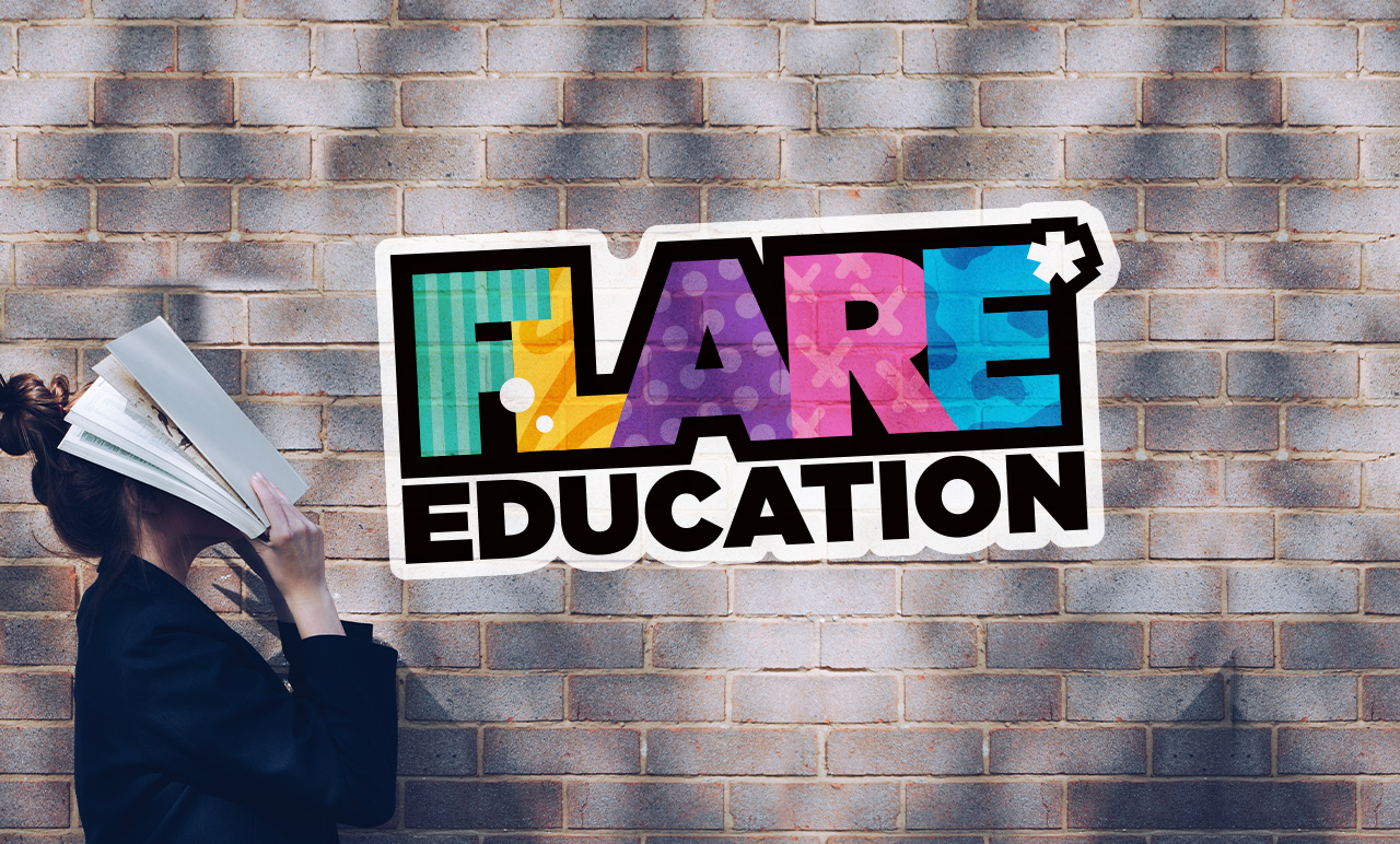
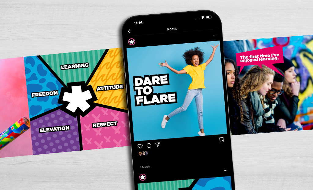
The name Flare* was selected for its dual symbolic meaning of a ‘Call for help’ and sense of reaching ones potential. In the logo the indivduality of each letter reflects the unique needs the students bring. With the Flare ‘asterix’ symbolically represting the person and tenants of the business. Freedom, Learning, Attitude, Respect and Elevation. Our style is colourful, urban and communicates in a direct no bs. language that is appealing to the students.


ANDY CROY – Head of Education
“Studio Lemonade’s approach is nothing short of exemplary, blending creativity with strategic insight to craft our brand to resonate deeply with our target audience. Their team’s ability to capture the essence of our brand and translate it into compelling, visually stunning content has been a game-changer for our business.”